Still.
Rubricator
— general theoretical part — presenting the brand to a wider audience — presentation for a professional audience — brand strategy — bibliography and list of image sources
General theoretical part
In mobile app design, communication plays a key role, functioning not only as a tool but also as the primary mechanism through which the user experience is created. Communication theory views the interaction between the user and the app as a systemic, interconnected, and symbolic process. In this context, the app interface becomes a message that is encoded by the developer and decoded by the user under specific conditions. The design of the app is not a static picture but a dynamic communication system, where visual language, interactivity, and information architecture serve as the code for dialogue with the user. The goal is not just to convey data but to evoke understanding, emotion, and action.
In the framework of semiotics, the interface of an application can be viewed as a text that users «read.» Interface elements, such as buttons, icons, and menus, serve as signs that convey specific meanings and instructions. User experience depends on the context in which the interaction takes place. Sociocultural factors, such as age, education, and cultural characteristics, influence the perception and interpretation of the interface. UX designers take into account users' emotional reactions to various interface elements. Empathy becomes an important aspect that allows for the creation of more intuitive and enjoyable products. The interaction between the user and the product involves cycles of feedback. Users can leave reviews that impact further development and improvement of the product. The design of the interface can convey messages without words. Colors, fonts, and visual elements can evoke certain associations and feelings, making them important tools in communication with the user.
Communication theory reveals an application not as just a code, but as a living environment for human interaction. It shows how the interface conducts a dialogue with the user. She explains how social norms are born in chat rooms and feeds, and icons and texts become the language of this environment. The theory allows us to understand how an application forms connections between people, manages attention through algorithms, and creates its own cultural codes. As a result, this is a view of a digital product as a complex communicative act, where everything — from architecture to notification — conveys meaning and builds relationships.
Still 2025
Presenting the brand to a wider audience
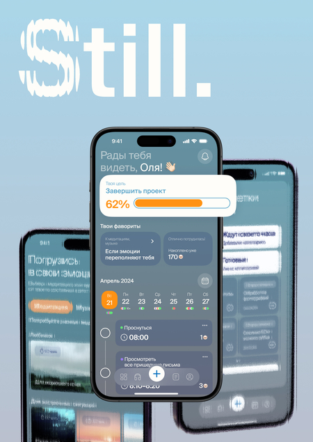
Still — a calmer way to organize your life
Still is an app created to help people with ADHD manage their day, focus on what matters, and feel more in control of their emotions and time. Life with ADHD can feel overwhelming: too many thoughts, sudden ideas, unfinished tasks, emotional ups and downs. Still doesn’t try to eliminate this complexity. Instead, it helps you work with it, not against it.
Calm first, productivity second. Still is built around the idea of calm. The interface is soft, fluid, and easy to navigate. Inspired by the sea, the design reflects movement without chaos. Colors are gentle, shapes are rounded, and interactions feel smooth and predictable. The app is designed to be a comfortable place you can return to, even when your mind feels overloaded.
Plan your day in a way that feels natural. You can plan tasks using voice input instead of typing, break big goals into small, achievable steps, and see your progress without pressure. Still helps you structure your day without turning it into a strict schedule that’s hard to follow. Progress indicators are supportive, not demanding. The app shows where you are, without making you feel guilty about what isn’t done yet.
Capture thoughts before they distract you. Random ideas don’t have to interrupt your focus anymore. Still lets you quickly write down or record thoughts, notes, and ideas so you don’t have to keep them in your head. You can return to them later, when you’re ready.
Support for emotional balance. When emotions become overwhelming, Still offers tools to help you pause and reset. Meditations, music, and calming content are available depending on your current state. You choose what you need — nothing is forced.
Flexible and personal Still adapts to you. You can customize parts of the interface, choose how reminders work, and build your own routines gradually. The app understands that there is no single «right» way to organize life with ADHD.
More than a planner. Still is not just a productivity app. It’s a supportive companion that helps you organize your life, manage attention, and treat yourself with more patience and understanding. With Still, self-organization becomes calmer, more humane, and more achievable — one small step at a time.
Still 2025
Presentation for a professional audience
Still is a mobile app designed as a caring friend that guides users in organizing daily life and managing ADHD symptoms. With 56% of surveyed individuals reporting ADHD impacts their daily functioning, yet 64% avoiding psychologists and 76,9% unsure how to cope, Still fills a critical gap. Unlike scattered analogs with partial features, Still focuses exclusively on ADHD relief- addressing self-organization struggles (50% of users noted this as the main manifestation of ADHD), impulsivity, emotional dysregulation, and anxiety-through fast, engaging tools that build lasting habits.
Core Goals and Tasks. - Empower users to ease ADHD symptoms by refining proven coping methods, introducing innovative ones, and fostering ADHD-specific habits. - Restore focus to planned tasks via intuitive nudges and rewards. - Deliver a dynamic, non-monotonous interface to prevent early drop-off.
App Character. Still acts as a supportive friend, gently redirecting users from overwhelm. Key job stories include:
Key Features. - Home Screen Focus: Prominent display of your main goal, followed by quick-access tools like guided meditation, calming music, earned internal currency for rewards, a task calendar with point-based incentives (e.g., «wake up,» «check email»). - Rapid Task Creation: Voice input or pre-set templates for instant planning. Insights confirm users crave a comfortable space blending familiar strategies with fresh, engaging ones-Still delivers speed and interest from the first tap.
Conceptual Advantage
Each feature is built around the individuality of ADHD experiences: distraction patterns, impulsivity spikes, emotional surges, and focus gaps are translated into daily tools, habits, and interfaces. Still stands out in a near-empty market by hyper-focusing on ADHD’s unique challenges, where general productivity apps fall short.
- Focus and Nudges. Home screen prominently displays your main goal, with personalized widgets like meditation, calming music, and earned internal currency. These cannot be replicated for generic productivity apps, making Still a truly exclusive companion for ADHD users—fostering emotional trust and preventing self-blame.
- Functional Tools with Innovative Mechanics. Task calendar rewards completion (e.g., «wake up,» «check email») with points, while rapid creation via voice or templates reacts instantly to random ideas or overwhelm. This blends practical utility with engaging gamification, turning the app into a «living guide» that reflects your real-time state and restores focus.
- Personalized Habit Builders. Users input daily challenges to generate detailed action plans, de-escalation prompts, or quick notes/sketches for intrusive thoughts. This approach turns the app into a reflection of your ADHD rhythm, building lasting habits and a strong sense of gentle, caring support.
Opportunities for Collaborations
There are wide opportunities for collaborations. - Psychologists & Clinics: Integrate Still as a pre/post-therapy companion, co-branded for referrals (e.g., shared progress exports). - ADHD Advocacy Groups: Partner for endorsements, user testing, and content (meditations co-created with experts). - Corporate Wellness Programs: Customize for employee ADHD support, with B2B analytics on engagement. - Tech & Health Startups: API integrations for wearables (focus tracking) or AI voice enhancements; joint funding pitches leveraging Still’s validated demand. - Content Creators: Collaborate on ADHD-focused podcasts/videos featuring app demos, driving organic growth.
Growth and Engagement Strategy
Still drives sustainable growth and user loyalty through a multi-channel approach that blends digital retention, community building, and tangible extensions — transforming ADHD management into a rewarding lifestyle.
User Acquisition via Targeted Campaigns. Development of social media of brand: Launch micro-campaigns on TikTok, YouTube, VK Clips, featuring real-user job stories (e.g., «From impulse chaos to calm plans»). Partner with ADHD influencers for authentic demos of voice-task creation and goal widgets, targeting the 76,9% unaware of coping tools.
Retention through Gamified Habits and Merch - Daily Streaks & Rewards: Internal currency unlocks premium meditations or custom themes; top earners get exclusive badges. - Still Merch Line: Release fidget toys (e.g., textured spinners mimicking app widgets, engraved with user goals) for impulse relief. Ship to loyal users (100+ points earned) as free rewards — boosting emotional attachment. Limited drops create FOMO.
Design and Visual Identity
Colors: Main Colors: White: #FFFDF9 R: 255 G: 253 B: 249
Black: #181A2C R: 24 G: 26 B: 44
Blue 300: #001872 R: 0 G: 24 B: 114
Orange: #FF9212 R: 255 G: 146 B: 18
Additional colors: Blue 100: #3CA2CE R: 60 G: 162 B: 206
Blue 200: #006DBC R: 0 G: 53 B: 188
Fonts
Monetization
Free and premium model. Core tools free, premium (350₽/month) adds advanced analytics, additional widget settings with daily tasks, as well as adding tasks and merch discounts.This strategy positions Still as an ecosystem—app + merch + community.
Investment Appeal
Still fosters a deep bond between users and their «caring friend» app, turning ADHD management into trusted daily support that reduces self-blame and builds lasting confidence—driving high retention and premium upgrades. Innovation and Market Edge: Hyper-focused ADHD tools with gamified nudges, voice-activated tasks, and personalized habit builders fill a near-vacant niche, outshining generic apps with exclusive, symptom-specific mechanics that command premium pricing. Scalability and Revenue Streams: Model scales to millions via low-cost acquisition, while merch, B2B integrations, and expert partnerships unlock diverse income.
Still transcends a mere app, emerging as a comprehensive ADHD ecosystem that converts personal struggles into personal value for users, collaborators, and investors—redefining mental health tech with emotional depth and explosive potential.
Still 2025
Brand strategy
Presentation to a wider audience
The presentation of the Still application is grounded in the communication theory framework introduced in the online course, which defines communication as a process of meaning creation through interaction, symbols, and context, rather than a simple transmission of information. This understanding directly shaped both the structure and tone of the presentation.
The course emphasizes that communication is processual and interpretive. Meaning does not exist inherently within a message but emerges through the interaction between sender and receiver. In the presentation of Still, this principle informed the decision to describe the application not as a fixed set of features, but as a communicative environment that adapts to the user’s mental and emotional state. The app is presented as a mediator between the user and everyday tasks, reflecting the idea that communication outcomes depend on interpretation and context rather than instruction alone.
The presentation reflects an interpretive theoretical approach, as defined in the course. Instead of seeking universal behavioral rules or measurable outcomes, the presentation focuses on user experience, emotional states, and subjective meaning-making. This aligns with interpretive theory’s emphasis on understanding how individuals perceive and negotiate reality within specific contexts. The narrative highlights fluctuating attention, emotional overload, and personal choice, framing them as meaningful experiences rather than problems to be corrected.
The presentation draws heavily on the semiotic tradition of communication theory. According to the course, communication operates through signs and symbols that convey meaning implicitly. In the Still presentation, visual elements such as calm colors, rounded shapes, fluid transitions, and the sea metaphor are described as communicative signs that signal safety, continuity, and emotional stability. These elements function as non-verbal messages that shape user interpretation before any textual instruction is encountered.
The phenomenological tradition also informs the presentation by foregrounding the lived experience of users with ADHD. The app is presented as responsive to individual perception, acknowledging that attention, focus, and emotional regulation are experienced differently by each user. This reinforces the course’s idea that communication must account for subjective experience rather than assuming uniform interpretation.
The presentation adopts a dialogical communication model, consistent with the course’s rejection of linear sender–receiver frameworks. Still is not positioned as an authoritative system issuing commands, but as a supportive partner that invites interaction and choice. This reflects the course’s emphasis on feedback, mutual influence, and meaning co-creation within communicative processes.
Professional presentation
The professional presentation of the Still application is grounded in the communication theory framework introduced in the course, which conceptualizes communication as a systemic, contextual, and goal-oriented process of meaning creation. This theoretical understanding informed both the strategic structure of the presentation and the way the product is positioned for professional stakeholders.
The presentation reflects the cybernetic tradition of communication theory, which views communication as an information system involving senders, receivers, channels, feedback, and noise. The professional narrative emphasizes data, metrics, and system efficiency, such as survey statistics on ADHD prevalence, user behavior, and unmet needs. These elements function as structured signals designed to reduce ambiguity and «noise» for investors, partners, and professionals, enabling clear interpretation of the product’s purpose, effectiveness, and market relevance.
The presentation adopts an objective theoretical approach, as defined in the course. This is evident in the reliance on quantitative data, market gaps, behavioral statistics, and clearly articulated goals and outcomes. The app is framed as a solution that addresses specific variables: self-organization difficulties, impulsivity, emotional dysregulation, and anxiety. This aligns with objective communication theory’s focus on causality, predictability, and problem-solving within complex systems.
The presentation integrates principles from the socio-psychological tradition, which understands communication as a process of influence and behavioral change. Features such as task nudges, rewards, gamification mechanics, and habit builders are presented as communicative stimuli designed to elicit specific user responses. The app’s mechanics are described as shaping attention, motivation, and emotional regulation through carefully designed interaction patterns, reinforcing communication as a tool for behavioral guidance.
The semiotic tradition also plays a key role in shaping the professional presentation. The app’s character as a «caring friend, ” its visual identity, color palette, and interface language are framed as symbolic systems that communicate trust, safety, and emotional support. These signs operate beyond explicit functionality, signaling values and positioning the product within the mental health and wellbeing domain. The professional audience is invited to interpret these symbols as indicators of brand differentiation and emotional resonance.
Still 2025
Barkley, Russell A. (2015). Attention-Deficit Hyperactivity Disorder: A Handbook for Diagnosis and Treatment (4th ed.). Guilford Press. 15.12.2025
Fogg, B. J. (2009). «A Behavior Model for Persuasive Design.» Proceedings of the 4th International Conference on Persuasive Technology. ACM. 15.12.2025
Escalas, Jennifer Edson (2004). «Narrative Processing: Building Consumer Connections to Brands.» Journal of Consumer Psychology, 14(1–2), 168–180. 15.12.2025
Kanner, Allison D., et al. (1981). «Comparison of Two Modes of Stress Measurement: Daily Hassles and Uplifts versus Major Life Events.» Journal of Behavioral Medicine, 4(1), 1–39. 15.12.2025
Eyal, Nir (2014). Hooked: How to Build Habit-Forming Products. Portfolio. 15.12.2025
Still — приложение для людей с проявлениями СДВГ // PORTFOLIO HSE URL: https://portfolio.hse.ru/Project/217975 (дата обращения: 12.12.2025)


