
Communication theory: COMMUNI.CAKE
About COMMUNI.CAKE
A confectionery where a brownie is a message, and the space is the communication channel.
Theoretical Foundation: Communication Theory in Design
In modern design, communication is understood as a fundamental process of creating and transmitting meaning, not merely as visual styling. It is a structured act in which design acts as a mediator between the creator and the audience.

Brownie shop exterior design
Key Applied Paradigms:
1. Semiotic Approach:
Design functions as a system of signs. Each element—color, form, typography, texture—is a signifier that refers to a culturally conditioned signified (e.g., warm natural shades → naturalness, authenticity).2. Sociocultural Approach:
Communication is viewed as a process embedded in cultural practices and rituals. Design participates in constructing social reality by offering new interaction scenarios within familiar contexts (e.g., rethinking the coffee break ritual).3. Rhetorical Approach:
Design communication becomes an act of persuasion based on the triad of ethos (trust in the source), pathos (emotional engagement), and logos (rational argumentation).4. Elaboration Likelihood Model (ELM):
Message strategy is adapted to the audience’s motivation and ability to process information, offering either peripheral cues (imagery, atmosphere) or central arguments (facts, logic).5. Narrative Paradigm:
Effective communication is built on a story, not a set of facts. The brand becomes the narrator, and the product becomes a plot element.

Some types of brownies
Thus, communication theory provides the designer not just with visualization tools, but with a strategic framework for constructing meanings and managing their interpretation within specific cultural and social contexts.
Presentation for the General Audience
Words run out. Taste begins.
There are feelings for which no precise words exist. Moments when you want to express care, share a mood, or simply take a conscious pause. Welcome to COMMUNI.CAKE — a café where a brownie becomes your message. Here, you choose not just a dessert, but what you want to say. To yourself or to someone next to you.


Brownie design as part of communication
«The Introvert»
for a quiet evening alone with yourself.«The Dialogue»
with a sour cherry layer — for an easy start to a conversation.«The Argument»
with chili pepper — for a surge of courage.Our space will guide you on how to «send» this message. Choose the «Decoding Zone» to immerse yourself in your thoughts or the «Dialogue Zone» at a shared table, where you can easily start talking with a new person.
COMMUNI.CAKE. Decode your taste. Find your tone.
Presentation for a Professional Audience (Investors, Partners)
The Experience Economy: Creating a Monetizable Environment for New Sociality.
Appealing takeaway presentation
Concept and USP
COMMUNI.CAKE is a research project at the intersection of gastronomy and communication theory. We are creating Moscow’s first venue where the product (a brownie) is positioned as a tool for conscious dialogue, and the physical space programs social interaction scenarios.
We sell not a dessert, but a ready-made personalized communicative experience, where consumption is inextricably linked to context and the purpose of communication.
Solving Target Audience Problems
«The Weary Communicator» (25-40 years old): Legitimizing a conscious pause and ritualizing a break in conditions of hyper-communication.
«The Connection Seeker» (20-30 years old): Reducing social barriers for meeting new people through game mechanics and a shared conceptual context.
«The Conscious Aesthete» (28-45 years old): Satisfying the need for depth, personalization, and intellectual engagement through consumption.
Business Strategy and Growth Stages
Year 1 (Launch and Validation): Opening the first location, forming a loyal community, testing menu and event hypotheses.
Year 2 (Diversification): Launching a B2B direction («corporate negotiation boxes»), seasonal limited-edition lines, and paid event formats.
Year 3 (Expansion and Strengthening): Opening a second location in a new format, developing expert status through content (podcast, columns), launching merchandise.
Dine-in tableware
Key Metrics (KPIs)
Operational: Average check (450-600 RUB), website conversion rate (3-5%), percentage of returning customers (20-25%).
Tactical: Engagement rate (ER) on social media (5-7%), number of UGC publications, event attendance rate (80-90%).
Strategic: Brand awareness in the target location (30%), Net Promoter Score NPS (50+).
Investment Appeal: We are creating not just a food service point, but a brand platform for a new type of social interaction, which opens up opportunities for scaling the model, partnership collaborations, and entering adjacent categories of «conscious» consumption.
Visual Identity: Design as a Non-Verbal Communication Channel
The visual system of COMMUNI.CAKE is designed as the main non-verbal conductor of the brand’s philosophy, materializing theoretical principles.
Brand Color Palette: Tones of Internal Dialogue
Base Color (85%): Deep terracotta-gray (#5C3317). Symbolizes «grounding,» silence, safe personal space. Creates an intimate atmosphere for introspection.
Secondary Color (10%): Soft beige-caramel (#D2691E). Encodes warmth, naturalness, a soft invitation to contact.
Accent Color (5%): Dusty, muted rose (#F5D9CA). The «voice» of the brand—a sign of emotion, delicacy, internal response. Used sparingly.
Typography: Two Voices
Primary Typeface: A clean geometric grotesque (e.g., Gilroy). Embodies logos — clarity, structure, modernity.
Accent Typeface: A light handwritten or calligraphic script. Embodies pathos — personal handwriting, emotion, human warmth.
Logo and Graphics
Logo: Designed as an imprint sign (a stylized letter «C»), alluding to the idea of a unique trace, seal, or personal impression.
Photography and Style: Contemplative minimalism. Focus on textures, tactility, play of light and shadow. Creates a mood of silence and anticipation.


Package design
Spatial Design: The Architecture of Communication
The interior materializes the theory through zoning:
«Decoding Zone»: Capsule seating, high tables by the window, acoustic comfort, subdued lighting. A metaphor for a personal «frame.»
«Dialogue Zone»: Communal tables, modular soft seating. Features a system of flag indicators (green/yellow) — a physical interface for regulating social interaction, reducing the risk of «losing face» (Politeness Theory).


«Decoding Zone» and «Dialogue Zone» design
Packaging and Digital Environment
Packaging: The concept of a «personal letter.» A matte cardboard box with blind embossing; the brownie’s name and message are hidden inside, turning unwrapping into an act of «decoding.»
Website: Navigation is built on the principle of choosing a mood, not a product. The first question: «What do you want to express today?» This implements the principle of dialogicity and message adaptation to context.
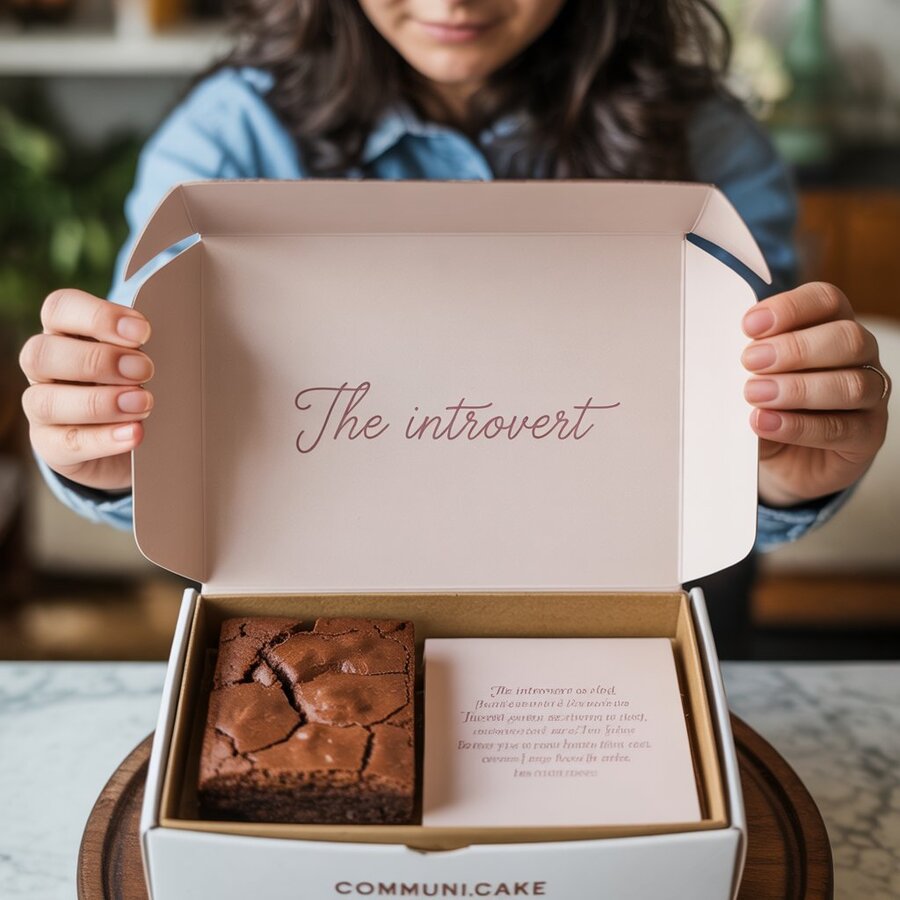
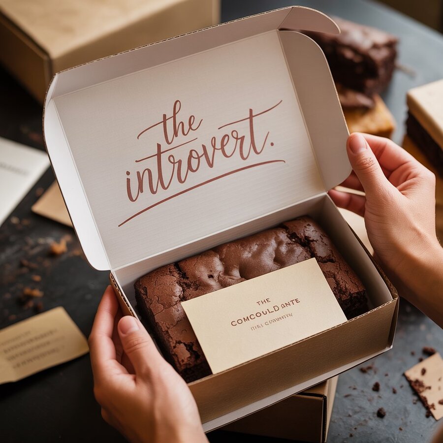
«Personal Letter» concept
Conclusion: From Theory to Practice. How Communication Theory Helped in Brand Creation
Communication theory became for us not a background, but an active design tool. It provided clear schemes for translating abstract ideas into material solutions.
1. Semiotics as the Brand Language.
We built a system of visual codes. The terracotta color (#5C3317) was chosen not intuitively, but as a conscious sign of «grounding» and warmth; the «imperfect» texture of the brownie in photos is a sign of authenticity, contrasted with industrial smoothness. Every element, from the imprint logo to the tactile envelope packaging, was designed as a signifier with a specific signified (personality, honesty, dialogue).
2. Rhetorical Triangle and ELM as the Communication Framework.
We adapted the core message for different audiences using the Elaboration Likelihood Model (ELM) and the rhetorical triangle.
For the general audience (peripheral route) we relied on pathos: atmospheric imagery, emotional brownie names («The Introvert,» «The Dialogue»), the language of feelings. This creates quick engagement and an associative connection.
For the professional audience (central route), communication is built on logos and ethos: financial KPIs, growth structure, ingredient quality as a rational argument, holistic design as proof of thoughtfulness and reliability.
3. Sociocultural Approach and Narrative for Integration into Life
.We are not just opening a café—we are introducing a new scenario into existing practices: the coffee break becomes a moment of conscious pause, a date becomes an occasion for sincere dialogue through choosing a «message.» The brand tells a story about how food can be a language and invites the viewer to become the hero of this story.
4. Cybernetics and Politeness Theory for Experience Design.
The key challenge—reducing social risk and creating a comfortable environment—was solved through the applied use of interpersonal theories. Our system of flags in the «Dialogue Zone» is a direct materialization of Politeness Theory and Impression Management. It gives the guest a tool to control interaction, protecting their «face» and minimizing awkwardness. This turns the space from a passive setting into an active, cybernetic channel with feedback.
Outcome:
The COMMUNI.CAKE project demonstrates that communication theory is a practical constructor for branding. It allowed us to:
Conceptualize (turn a «brownie» into a «message» through semiotics).
Structure (separate communication for different audiences via ELM and rhetoric).
Materialize (translate ideas into zones, packaging, interfaces through a sociocultural approach).
Humanize (design comfortable interaction through politeness theory).
Thus, we have created not just a confectionery, but a coherent communicative ecosystem, where every detail, from the HEX color code to the flag on the table, is the result of a conscious choice based on theory. This confirms the thesis of the course: a deep theoretical foundation is not an academic burden, but a key competitive advantage for creating meaningful and sustainable brands.
List of Sources on Communication Theory in Design and Branding
1. Foundations of Communication Theory
Craig, R. T. Communication Theory as a Field (1999). Shannon, C. E., & Weaver, W. The Mathematical Theory of Communication (1949). McLuhan, M. Understanding Media: The Extensions of Man (1964).
2. Semiotics and Visual Communication
Barthes, R. Mythologies (1957) / R. Barthes. Mythologies. Hall, S. Encoding and Decoding in the Television Discourse (1973).
3. Rhetoric, Narrative, and Persuasion
Aristotle. Rhetoric. Fisher, W. R. The Narrative Paradigm: In the Beginning (1985) / W. Fisher. The Narrative Paradigm. Petty, R. E., & Cacioppo, J. T. The Elaboration Likelihood Model of Persuasion (1986).
4. Sociocultural and Critical Approaches
Goffman, E. The Presentation of Self in Everyday Life (1956) / E. Goffman. The Presentation of Self in Everyday Life. Heath, R. L. (Ed.). Encyclopedia of Public Relations (2005).
The project is based on materials from the Communication Theory course.
All images are created with the ideogram


