Projector magazine. Issue № 43
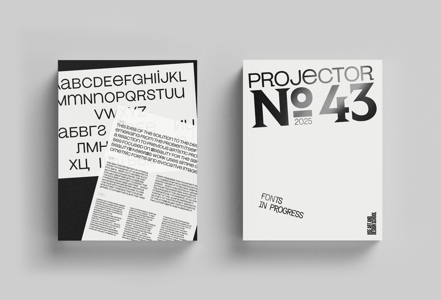
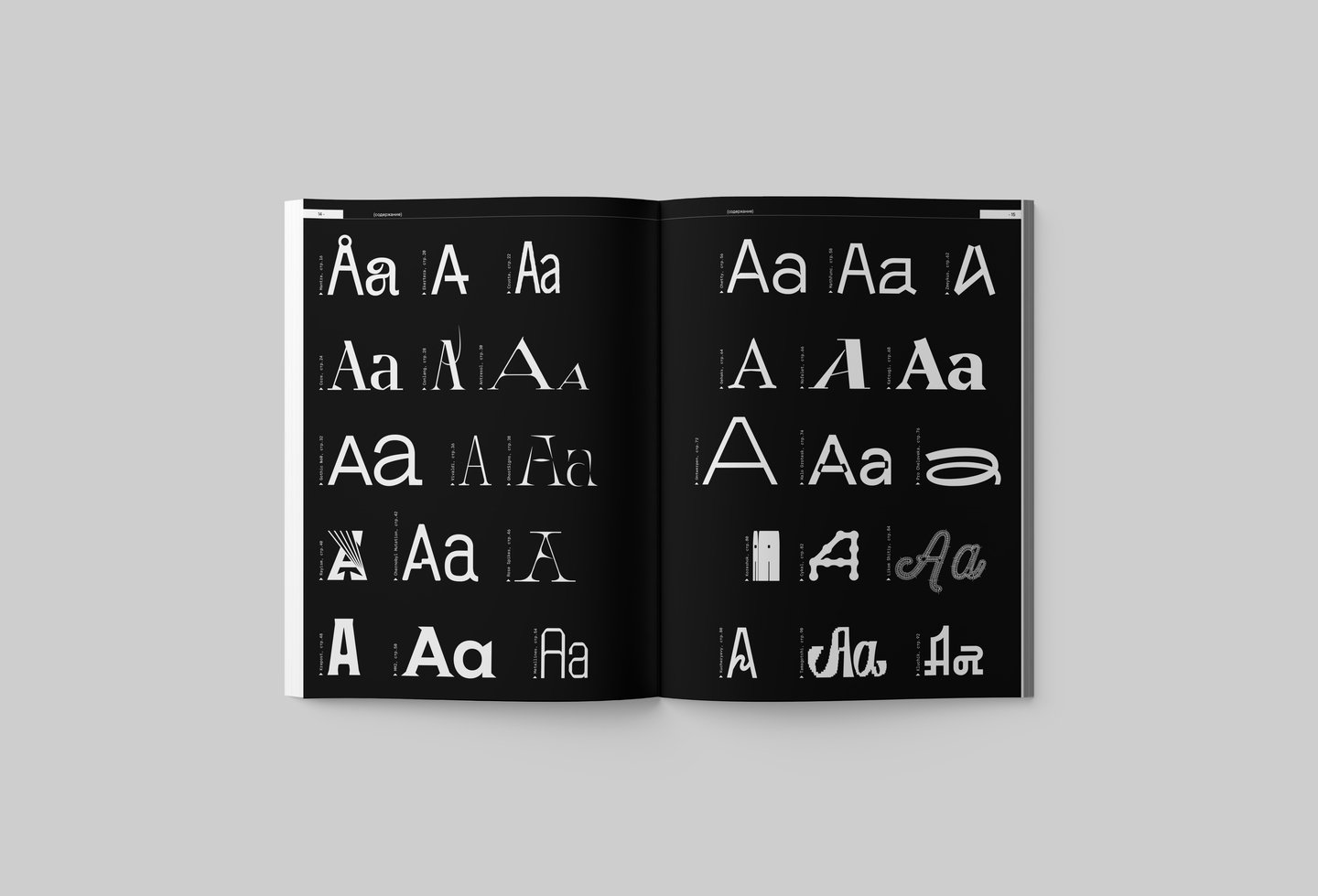
After two years and four international issues of the magazine devoted to research on the design of Hungary, France, Israel and Turkey, we return to the material that surrounds us at the ICU School of Design, which we ourselves are with our students and produce. This time we decided to make a single issue of the magazine dedicated to the best font work of our students.
Over the past couple of years, according to my observations on the development of our Commdiz, it’s the direction of the font design that shows fantastic qualitative and quantitative growth. The font is now not only in the third year program, as a mandatory modular exercise, but also one of the most popular variations and a steep course of supplementary vocational training. Realizing how much effort and hard work it takes to create even one excise design, I find it hard to believe that students achieve such outstanding results in such a short period of time. However, this is true — for just one training module, young designers create very classy fonts, each of which has its own expressed character and acute graphical relevance. I guess it wasn’t possible without the drive and the pleasure of the work process. I’ve said many times that there’s a lot of hormonal joy in our profession. Someone gets it from chocolate, someone from a long sleep on a Sunday. And designers from their work, of course, we’re super lucky!
My own novel, with letters, unconscionable piloting, taking its roots in a «domestic typeface» (the terminus introduced by Olga Floren in the book «Psychology of domestic font», published by Red Seaman, 2001) began more than 20 years ago when I served as art director of the magazine «Adras Petersburg». At that time, under the heading «The Street», I analysed with interest the manifestations of design, mainly vernacular, in the urban environment. And in the course of working on one of the numbers, when I photographed and described the phenomenon of «former signs» — print marks on facades — the term «graphic archaeology» was born. Subsequently, the term was firmly rooted in the professional background, both through the book «From the Psychology of the Household to Graphic Archaeology» (in «Literra Scripta», SPb., 2006), which was published under my revision, and through my Graphic Archaeology course, which was attended by more than 600 students from 2011 to 2017.
I’m very fond of character typefaces, idiots, in the good sense of the word. By means of letters, I’m sure you can convey any message without using an illustrative row, be it graphics or a photograph. The letters in my painting of the world can be evil or friendly, lazy or sporting, tasty or nasty. I always look at our students' font projects with great interest, and each time I’m very happy to meet them not only in our online portal, but also on the streets of the city in external advertising, in print and in Identity. Already, many of the scripts created at the Design School are changing modern visual communication, making them more expressive and sharp, helping designers to reveal the nature of their projects.
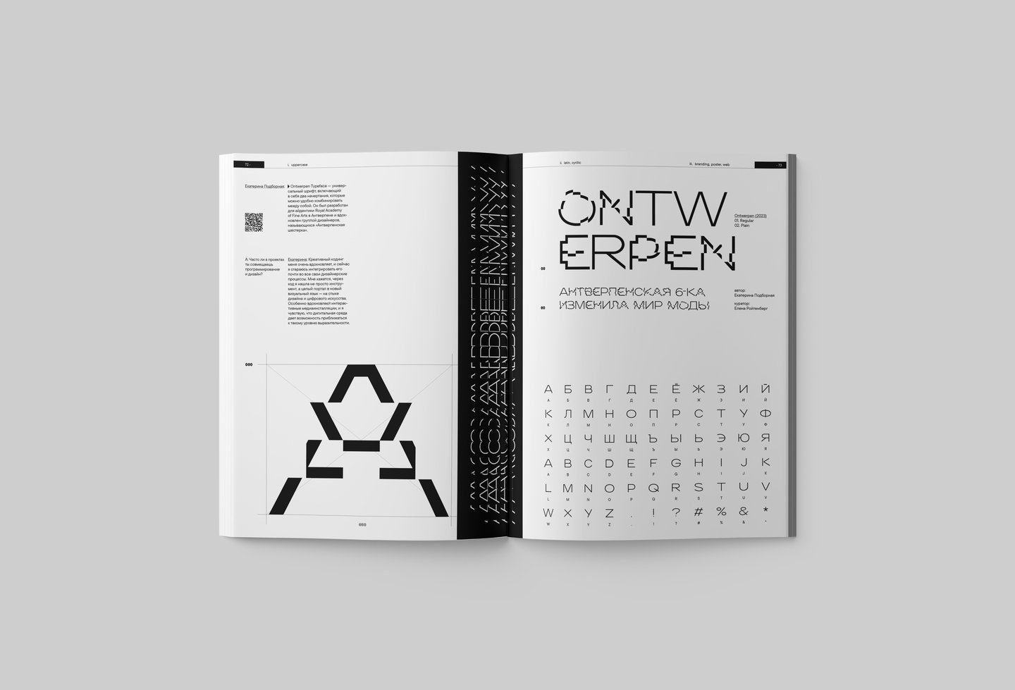
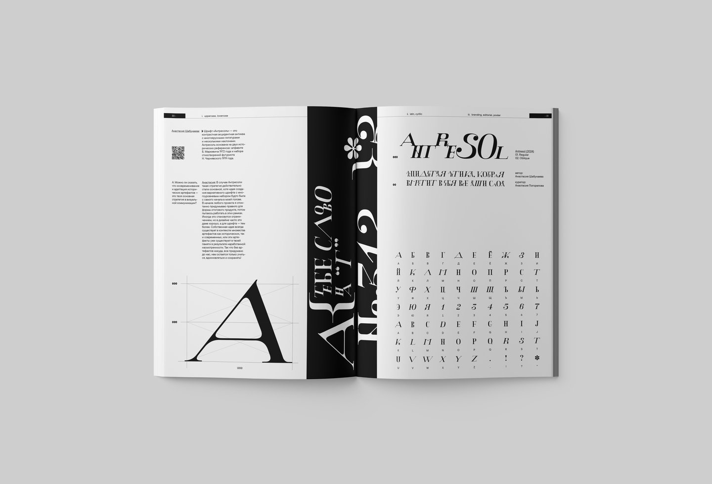
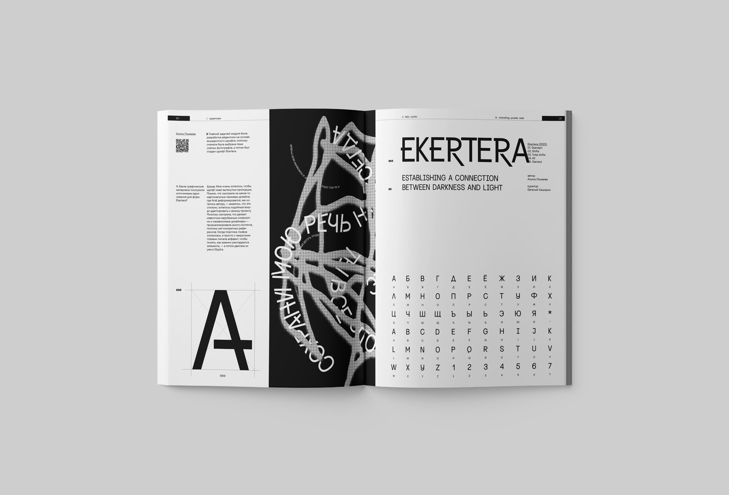
I congratulate all the authors whose work has been selected for this «Projector» issue, which is a serious proof of your high professional standing!I thank my fellow teachers, who share their passion with the students for letters that give them interest and lead the projects to a remarkable final result. And to all readers, I’d like to get high from another letter number. Yes, by the way, many of the typefaces published can be downloaded from our website for free — use your health!


