dial land
«Dial Land» — магазин интерьерных часов. Особенность бренда заключается в невероятно широком ассортименте и невысокой цене, благодаря чему каждый может приобрести понравившуюся модель, даже если не планировал расходы и просто проходил мимо.
Метафора оригинального стиля — постоянное вращение шестеренок внутри часов, поведение типографики так же уподобляется движению механизмов.
Нейросетевой ребрендинг
Теперь основа айдентики — наскоро написанные маркером слова и пометки работников, слова, которые обычно не достигают итогового потребителя и нужны для поддержания слаженности внутри производства.
Это не просто магазин часов, а прямой посредник между производителем и покупателем, dial land не приукрашивает, а передает так, как получил, без наценок и пафоса.
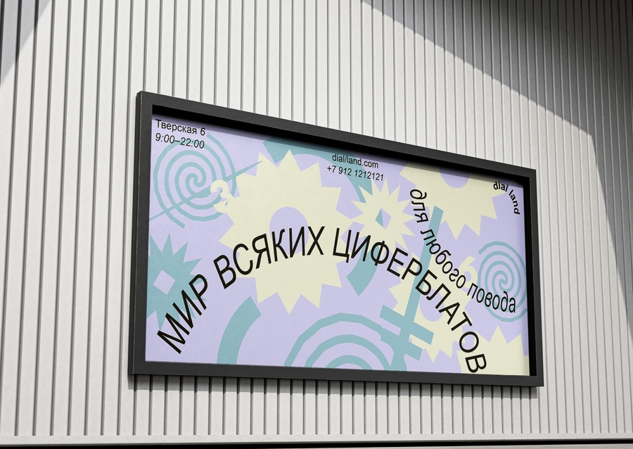
серия постеров
помощь в написании промптов оказывалсь Deepseek после промпт вводился в Imagen
этапы работы
- концепция для ребрендинга, придуманная самостоятельно, детально объяснялась Deepseek
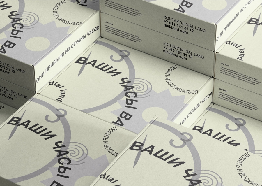
- на основе концепции в Imagen создавался типографический логотип сразу представленный на нескольких поверхнстях промпт для лого на картоне: A rough, industrial typographic logo for «dial land» that looks like it was hastily written with a permanent marker on a cardboard box or product back. Messy handwritten style, uneven letter heights, imperfect alignment, with marker bleed and rough edges. The text should feel rushed and utilitarian, like factory markings. Dark charcoal grey or faded black color, as if written with an actual marker. No decoration, pure functional aesthetic. industrial design, warehouse aesthetic, DIY feeling, no clean lines промпт для лого на задней части оранжевых часов: Photorealistic A3 poster. Extreme close-up on the back of a round clock made from vibrant, glossy orange plastic. The surface is reflective and shiny, showing subtle fingerprints and light reflections. Centered on this orange plastic is the large handwritten «dial land» inscription in the EXACT SAME handwriting style as the original logo — with the specific letter forms: uneven letter heights, rough edges, casual marker strokes, and the distinctive way the 'd', 'i', 'a', and 'l' characters are formed.
The marking must show authentic black permanent marker texture with ink bleed and uneven ink distribution, exactly matching the original branding. The clock is positioned to dominate the foreground, slightly angled to show its thickness.
In the background, a deeply out-of-focus flea market environment with countless other clocks visible as colorful bokeh shapes. The background has muted sepia tones with bright color accents popping through the blur.
Shallow depth of field, professional lighting that highlights the glossy orange surface. CRUCIAL: The «dial land» text must be identical to the original handwritten marker style from the brand guidelines. после изображение с логотипом загружалось в WhatTheFont
- после в Imagen генерировалось пространство промпт для внутреннего интерьера магазина: 3) после в Imagen генерировалось пространство промпт для внутреннего интерьера магазина: Interior of a chaotic clock shop «dial land». Wooden shelves overflowing with extremely diverse wall clocks: large industrial factory clocks next to tiny vintage alarm clocks, minimalist Scandinavian designs beside ornate Baroque grandfather clocks, colorful pop-art clocks alongside rustic wooden dials. Some clocks are stacked on the floor, leaning against furniture. A slightly crooked vintage rug on the wooden floor. Unopened cardboard boxes with handwritten «dial land» markings scattered around. Walls completely covered with hanging clocks of all sizes, shapes, and eras at different angles. The space feels discovered, uncurated but magical. Soft natural lighting from a dusty window, warm atmosphere like a treasure hunt.
detailed interior, flea market aesthetic, maximal variety of clock styles and sizes make dials on the floor also be diverse in color, form and styles
промпт для создания локации летней веранды: Photorealistic summer veranda densely packed with clocks. The key focus is extreme diversity: clocks vary dramatically in size (from tiny 10 cm dials to massive 1 m faces), style (minimalist, ornate baroque, industrial, vintage, rustic, art deco, modern, steampunk), shape (round, square, hexagonal, oval, triangular) and color (bright red, deep blue, forest green, black, white, wood tones, metallic gold and silver).
The space features weathered wooden shelves and vintage dressers overflowing with this eclectic mix. Only 2-3 potted plants with green leaves (no flowers) provide subtle accents. A few people browse the collection, examining different clocks.
Natural summer lighting with sunbeams filtering through climbing ivy. The overall color palette is neutral with clocks providing all the color variety. The scene should feel like a curated chaos where every clock is unique and distinct from its neighbors.
summer market aesthetic, golden hour lighting, hyper-realistic, maximal clock diversity, mixed materials and eras, place logo on some surfaces
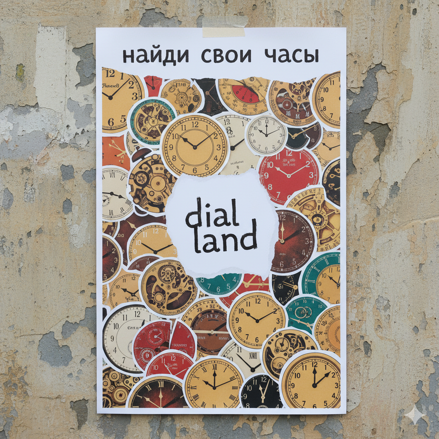
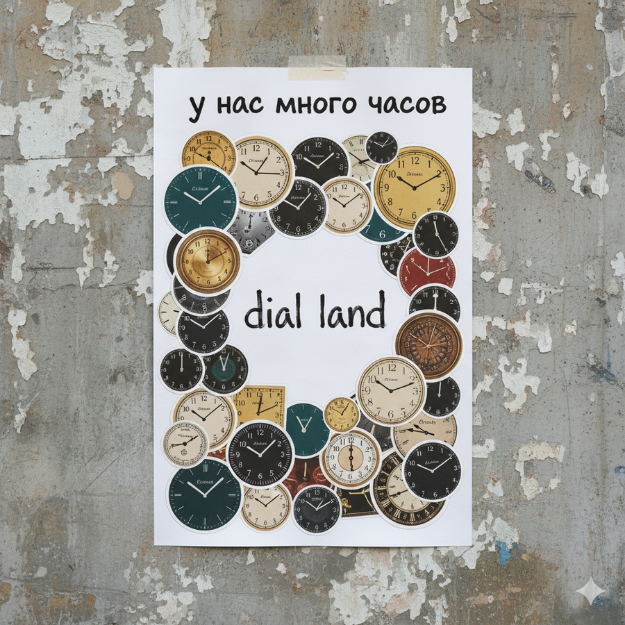
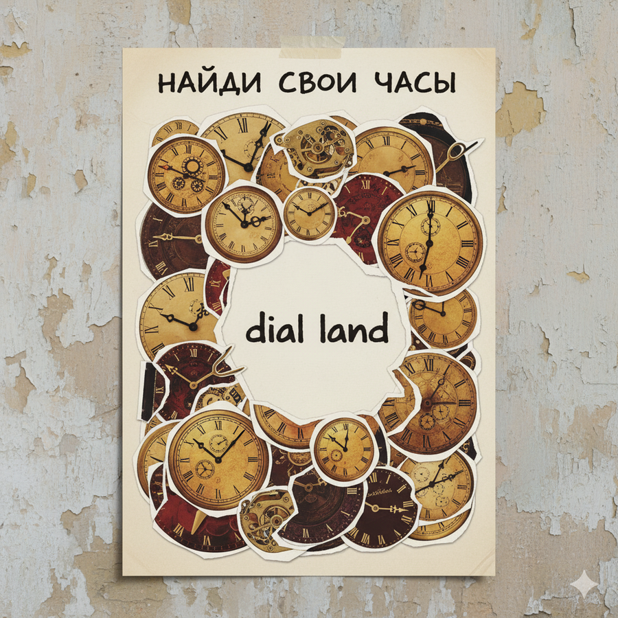
- генерация плакатов промпт для первой серии: A3 poster in Dadaist collage style. Multiple clock dials and faces of different styles, sizes, and eras appear as if cut out from magazines and catalogs with visible rough white borders and scissor marks. These paper cutouts are layered and overlapping at various angles across the poster, creating a dense, chaotic composition.
The top quarter of the poster is left empty except for the handwritten Cyrillic text «у нас много часов» in a casual, imperfect style.
The central area is kept clear of collage elements, creating a visual resting point. Here, the «dial land» logo is placed, reproduced with exact accuracy: the specific handwriting style with uneven letter heights, rough edges, and most importantly, the realistic texture of black permanent marker showing ink bleed and stroke variations.
The color palette is muted, drawing mainly from the brand colors 0396A6, BF961B, 593B20, BFAB99, A60808), but appearing on aged, textured paper. The overall background of the poster is a simple, light neutral color.
The poster is photographed as a physical object, taped to a textured urban wall, casting a soft shadow. The mood is intentionally raw, artistic, and authentically chaotic, reflecting a curated collection of unique items.
Style: Dadaist collage, paper cutout aesthetic, authentic typography, handmade design, urban art (на основе промпта для первого постера создавались два других, отличалась только цветовая гамма и слоган на кириллице)
промпт для второй серии: Photorealistic A3 poster hanging on rough gray urban wall. Top third features handwritten «dial land» logo in marker style. Lower two-thirds show grid of 12 square photos of different clock dials — vintage, modern, industrial, colorful — arranged like Polaroid pictures stuck on the poster. Each dial is unique in style and era. Text at bottom: «Ваши часы ждут» in casual handwritten Cyrillic. The poster has realistic texture, slight wear, and natural urban lighting.
urban poster series, grid layout, diverse clock collection, realistic printing texture (на двух других постерах изменялось только количество фото, которые располагались по строгой сетке 4 на 3, и слоган на кириллице)
после три готовых плаката прикреплялись в качестве референса с проптом: Photorealistic image of three A3 posters hanging on a rough gray concrete wall in an urban environment.
- лого на бетонной стене создавалось последним, в Imagen промпт: Urban concrete wall with weathered texture, graffiti marks, and peeling paint. The «dial land» logo is handwritten in black permanent marker directly on the concrete surface, showing authentic marker texture with ink bleed and rough edges. The logo should be looking as it was before — written with alcohol marker, presented on the pinned file, logo is placed slightly off-center, at eye level. Natural daylight casting soft shadows, photorealistic style, urban environment background slightly out of focus. The concrete texture is highly detailed with cracks and imperfections.
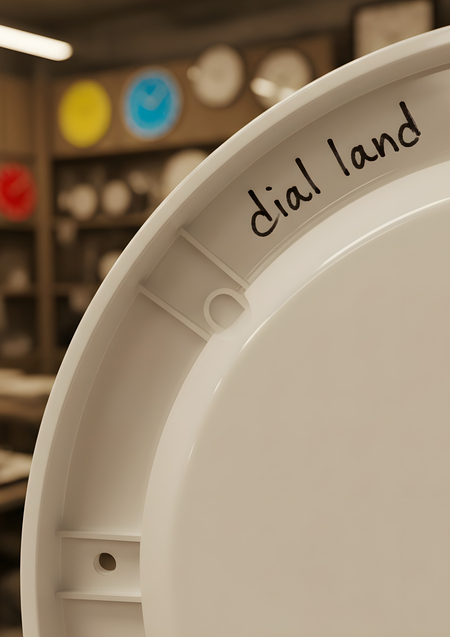
urban art, street branding, authentic marker handwriting, concrete texture, environmental design 6)фото с обложки также из Imagen промпт: A3 poster, photorealistic style. Extreme close-up on the back of a simple white glossy plastic wall clock, occupying 50% of the frame. The clock is slightly rotated to show its three-dimensional form and thickness.
On the white plastic surface, the handwritten «dial land» is scrawled in black permanent marker near the edge, showing authentic marker texture with ink bleed and stroke variations. Visible details: screw holes, plastic molding seams, subtle reflections on the glossy surface.
The background is a deeply blurred flea market clock shop interior in sepia tones — browns, tans, and creams. A few brightly colored clock dials (vivid red, electric blue, sunny yellow) create striking color accents amidst the muted background. Shallow depth of field, dramatic lighting that highlights the texture of the plastic and marker.
The composition feels like a discovery — finding a hidden signature on a mass-produced object. Professional product photography, macro lens details.
Использованные нейросети
изображения (в Imagen внутри Gemini): https://gemini.google.com структурирование промпта: https://www.deepseek.com/en определение шрифта из логотипа: https://www.myfonts.com/ определение цветовой гаммы: https://color.adobe.com/ru/create/color-wheel
")
")

")