Wonders Your Pretentious / Calligraphic Project

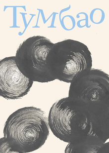
It is encouraging to report that we have received tangible implementation of the project that I and colleagues have been working on since 2023. This is our dear book, «Constantin Prevlavski’s Assault Prayer». The artist and the calligrapher Darius Jems-Levie came up with the idea of writing an ancient beautiful prayer-formulation with different handwritings in modern form. She invited three other calligraphers to participate in the project: Anna Baskovu (Uppet), Catherine Volkov and me (Vera Bobikov).

There was a «small but great» (as one of our colleagues said) book, the odor of Russian carpentry. At each turn, the letter of the Old Slavic alphabet and the writing of the writing of the text of the prayer line, which begins with this letter. The compositions are very different — expressive and discreet, virtuoso and ethetic, transparent and dense, readable and not very much — as is the historical Russian signature itself. The large letters written by the brush, and the entire set text, are the font of Anna Basco’s «Snark» in its handwritten and typed form. The book is also decorated by Daria Jems-Levie’s drawings of Karion Istomin.
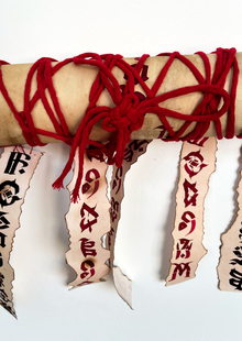
Many of our incredible compositions have a specific historical background and are the echo of calligraphy research. These are my compositions in the letters of Buki, yes, Igé, Thinking, Rits and Beast. And so is Fert and Little Yus. The paper for Buka («God the Founder») was born from a popular 17th-century calligrapher prayer, «Fine to Eat» (from a scroll in the Goritzk monastery in Peryaslavl-Zales/WGADA). F. 181. MGAID. Oops. 3. D. 252 (?)), where the entire text is placed in one very tight line. A huge number of protruding elements are not just decorative features. It’s an opportunity to write a lot of letters outside the line. The letters fly and fall into the wind, stick, curl up and teas — try reading.
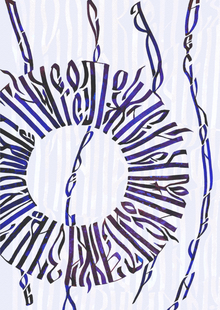
The letter is (also a success for all) — its common carpentry form — in itself a letter of barbarism, so for it I chose the 17th-century handwriting from the Great Ustüg (Shifr: 81; Avt sign: A35; Inv: R — 6556), which was posted on my website by the Vologodian Regional Library. It is a very Baroque, fancy, hard to read letter, in the original form, which is a dense lace, where the line, without interrupting, appears, endlessly entwined letters and decorations — and sometimes it is impossible to separate one from the other. This stylist, a curly and very feminine one, led me to put the inscription in a circle, to decorate the heart pins that meet in the original.
The Ritsa (Ruze Bo’s grief in my sleep) is written on the basis of the 17th — century business carpentry. P. I. Dubrovsky, a bloated Cole Voivodeship, about the shipment of 285 firefighters to the Solovec monastery and the loan of bread from the ex-cons (GRADA, F. 159). It’s the order of a new mess. Oops. 3. D. 560. L. 172 — 172 rev.) drew my attention to the horizontal focus, which is the horizontal bar that is assembled in a single element by a number of standing letters. It has the effect of highlighting the lines, drawing out the base lines with the light-point bar. I reinforced this image by releasing a few letters below the base, so that their horizontal elements would also be part of this dot. I also tied up a long vertical ligature to make the composition more dense and complete.
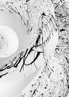
Think of the letter (the Mercy of your God, asking for a zeln) as well as the capital alphabet at the first long turn of the book (and all of these folding turns five) is a tribute to the brightest and most recognizable reception of the Russian carpentry, with the force of the text block’s «brown tail» or «beach blow.» These lines, which have a rigid but not an oval, but a slightly confusing characteristic plastic, can be lighter, as in the alphabet, or have a strong influx, especially in the diagonal direction, as in the composition of the letter Moslet. Such elements can be found in the 17th-century business carpentry, when the whole text, usually quite bright, is enriched by the additional rhythm created by the same pressure accents going in the same direction. And in scrolls, this form of stroke turns into a long splash, and such splashes can be rolled around in the fields of the manuscript.
With this book, we want to continue the tradition of Russian carpentry, an unforgettable outstanding phenomenon of Dopetrov’s book culture. Photos of Anna Bastok, Daria Jems-Levie and Maria Scopina. t.me/modernskoropis


