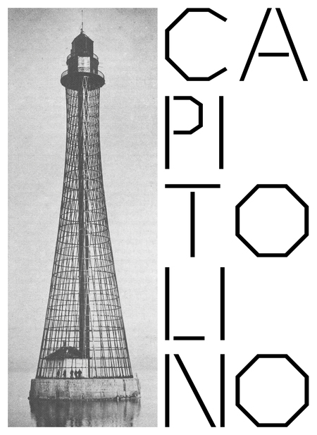
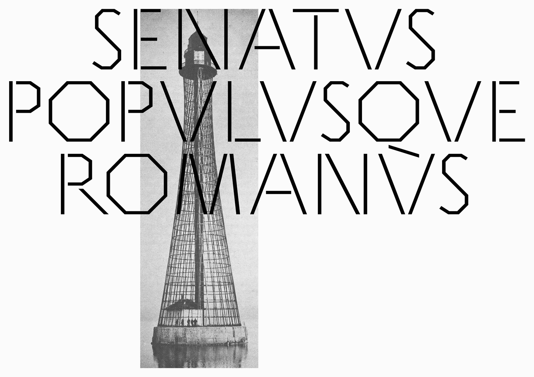
CAPITOLINO·SPECIMEN·MMXXIV
A calendar reflection on the nature of the Capitolino typeface, combining the nature of Roman capital lettering with technical aesthetics. The modernity and lapidarity of the typeface seamlessly leads to a visual dialog about architecture.
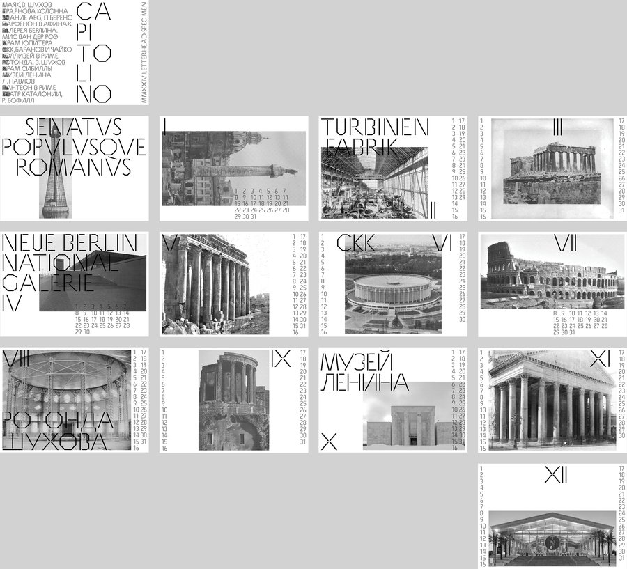
The calendar is 14 posters — 12 months and two sides of the cover.
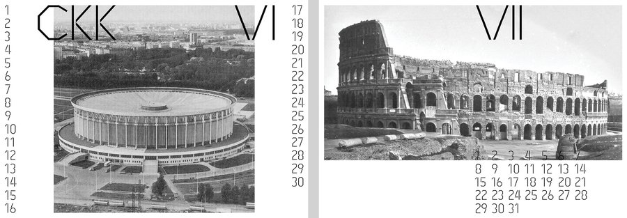
When stacked, the posters begin to work with each other to create semantic and associative rhymes.
December is the only month that does not have a pair, so the image chosen was a building that emphasizes its connection to antiquity. The glass cube inside the conventional Parthenon is the National Theater of Catalonia.
8a41e692023a4ee586b07521d8ddeab4
Thanks to Valery Golyzhenkov and Letterhead Studio for providing Capitolino font for the project!


